Tackling bulb’s Universal Header for Navigation (Design)
Identifying the Problem
As one of bulb’s UX Designers (and researcher), I was able to have frequent discussions with the CARE team’s leader. During one of our conversations, she had presented to me a repeated concern coming from both herself and the customers of bulb: they all wished the website was easier to navigate through. Often times, users were struggling to locate certain feature links on both their own pages and those of others, as well as knowing how to return to previous pages without needing to rely on the browser’s back button.
Role: UX Designer
Method: Wireframing and prototyping
Tool: FIGMA
Wireframes
Low-Fidelity Wireframes
Below are simple wireframes for my approach towards the project. The project owner wanted to keep the drop down-like menu the website currently utilized, so in keeping to that request, I opted to break down the menu options into four icons to act as a universal header, as opposed to bulb’s ever changing one. An additional request was made by the CARE team, inquiring about having footer for the website. Overall, the goal for this menu was to create consistency and simplification of navigation for the user. After creating these wireframes, I moved on to high-fidelity versions, implementing any changes required after feedback.

A tab for likes and notifications

The avatar icon drops down to a menu pertaining to the user's account etc
A second iteration of the previous slide (account menu)

A tab for groups and any organizations the user may be part of.

A footer, at the request of the head of the CARE team

A search options, including filters for easier functionality.
High-Fidelity Wireframes
Notifications
In the high-fidelity wireframes, I added hover states, active tab colors, and endeavored to achieve more consistency overall in the design while maintaining the website’s current aesthetics/pallet. While the innerworkings of the navigation were sorted out, I also wanted to really establish that this is a universal header. This meant creating a wireframe for what the screen would look like to users when they visited the pages of others, as well as their own.
Previously, the header would change in various ways: the logo would jump around from the center to the left side of the header, and the menu options usually accessible from the portfolio were no longer available. With my redesign, the icons and logo remain fixed. In addition to this, I provided a back button in the form of a chevron that will remain on the left side of the headed until the user returns to their original place in their journey and an improved triple dot menu option that opens a modal containing all the ways in which a user can interact with the page. The previous method was a drop down menu that opened a modal for each option — sometimes a second modal, depending on what the user wanted to do.

Activity tab.

Likes tab.

The hover state for liked pages.

Hover state for the 'Likes' tab itself.

Navigation icon tooltip.
Community

Groups tab.

Group hover state.

Create a group hover state.

View closed groups hover state.

Navigation icon tooltip.
Avatar/Profile

Version A

Version A hover state.
Version B of the avatar menu

Link hover states.

Tooltip for Version A menu.
Search

The search bar with a filter selected.

Search button hover state.

Navigation icon tooltip.

Filter criteria hoverstate.
Portfolio (home page)


Community tooltip.

Avatar tooltip.

Notifications tooltip.

Search tooltip.
Viewing your own page, & triple dot modal

Viewing your own page (gives the ability to edit and adds an easier way to interaction with pages in general via like, comment etc icons).

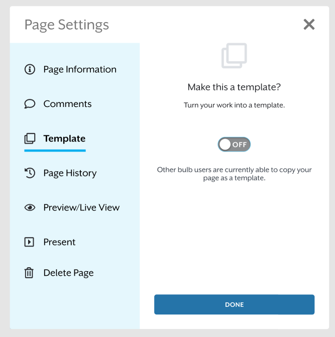
Within the triple dot menu, page settings are accessible, instead of the long drop down which opened more modals.


Viewing a stranger’s page


