
Crystal Clear
Crystal Clear is an app that was created solely as my thesis project while in the UX Design Master’s program at MICA. The goal is to combine crystal identification and education in an easy and seamless way. This project took place over the span of eleven weeks.
WHAT’S THE DEAL WITH CRYSTALS?
Gemstones are a $1 billion industry, and only increasing after COVID struck.
Diamonds are less coveted in comparison.
Crystals are used as household decorations, part of collections, studied, and used for spiritual purposes.
You can walk into almost any type of store and see a crystal being sold to the general public these days, all thanks to their growth in popularity.
Countless celebrities express their adoration of gemstones and use references in their marketing:
Kate Hudson (amethyst)
Adele
Gwyneth Paltrow (rose quartz)
Victoria Beckham (black obsidian)
Bella Hadid (blue celestites)
Kylie Jenner
Lizzo
THE PROBLEM
A crystal buyer or collector who feels confused when identifying a crystal, and recalling their corresponding information, needs to repeatedly track down and research each crystal, but faces an overwhelming amount of possible results for each crystal they own.
TARGET AUDIENCE
With crystals/minerals constantly rising in popularity, users who will benefit from Crystal Clear are:
New crystal buyers
Crystal owners with vast collections
Those searching for crystals in nature
Crystal sellers
Teachers
KEY STAKEHOLDERS
Wholesale crystal sellers
Need to identify your product? No problem!
Influencers part of the crystal community
Using the app for quick information to post is a breeze!
Small metaphysical shops
What better way to advertise and sell to new customers?
Schools
Geology at the tips of your students’ fingers!
ASSUMPTIONS
Keeping track of 10+, or even only 5, crystals at one time is overwhelming. They each have a plethora of correspondences that people of different lifestyles will want to remember.
Whether it’s generic names to scientific, or astrological ties to metaphysical uses, anyone purchasing or keeping crystals have a lot of information to retain.
Identifying a crystal based on its colour alone isn’t always enough. Using a camera to help identify -- or at least narrow down -- crystals, the same way other apps identify plants, can cut down a user’s research time in half.

RESEARCH
A competitive analysis was done in order to see what had already been done. The top three crystal guides or identification apps were researched during this process, all of which having earned 4+ stars in their respective stores (Apple and Google). Regardless of their scores, the same complaints could be found in at least two of the three applications’ reviews: a lack of camera identification, no scientific information, a lack of crystals listed, no access to bookmarking features, and being available on Android.

Initially, I was under the impression there would be two types of personas using Crystal Clear: an experienced collector and a future collector. I quickly discovered both these groups all had the same concerns and could be formed into a single persona: Tessa.
PERSONA CREATION
After conducting user research, I found the following trends:
All found remembering names to be difficult, as well as remembering the corresponding information tied to the crystal. Often times they would all use Google and look through more than one website on the results page in order to find the information they wanted.
Most purchased their crystals online.
Most wanted more crystals to add to their collection (or start one).
All wanted to learn more and considered the ability to do research the most important when dealing with crystals.
One was concerned about whether or not crystals purchased were real.
None of the interviewees had used a crystal identification app.
All were excited about:
identification via camera
having lists and information on all their crystals in one place.
With this information, I decided upon three main paths the persona, Tessa, would likely often walk through when using Crystal Clear: identifying crystals, keeping track of crystals, and looking up information on a crystal.

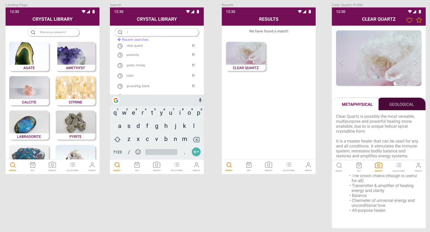
IDENTIFYING CRYSTALS

KEEPING TRACK OF CRYSTALS

LOOKING UP CRYSTAL INFORMATION
USER TESTING (ROUND 1) & CHANGES
The following were comments made by those walking through each screen/step and their thoughts on the process.
The process/steps are efficient and to the point
The heart (collection) and star (wishlist) symbols had confusing meanings at first, without the menu bar having labels for each
The landing page choice makes sense
Instead of follow-up questions, maybe have a “is this result correct? Yes or no” option instead. This way the algorithm can mark down what the correct answers looked like vs the wrong ones.
Below are edits/improvements I saw to implement on each path when creating the high-fidelity prototype.
IDENTIFYING CRYSTALS
An extra screen should be inserted for the user to investigate which suggested result is correct. This way a singular answer is saved to the database, and helps to improve the algorithm.
Placing the heart (collection) and star (wishlist) icons beside the crystal’s name, in hopes it will be noticeable, but not in the way of images, as well as easy to access no matter where the user is on the profile page.
Adding chevrons to allow for an image gallery the user can scroll through for controlled browsing of various images of the crystal.
Making the “confirm” or “try again” expandable so the user is able to read through the profile information before selecting a final option.
Adding a “Glass” option in order to allow users to see there is a possibility of their crystal being fake.
KEEPING TRACK OF CRYSTALS
In order to try and make the meaning of the heart and star symbols clearer, possibly label each on the navigation menu.
For the follow-up questions, perhaps a “yes” or “no” format would be easier for the user to clear up any doubts the algorithm may have about the results it found.
LOOKING UP CRYSTAL INFORMATION
Those who tested this path said it was the most straight forward and that they had no qualms with the way it was presented. At this point in time, I had no updates to add, however this changed during the process of creating the high-fidelity prototype.
HIGH-FIDELITY PROTOTYPE: 1ST ITERATION

KEEPING TRACK OF CRYSTALS
LOOKING UP CRYSTALS
USER TESTING (ROUND 2) & CHANGES
The following were comments made by those walking through each screen/step and the changes I would implement on the next iteration.
The white background for the information/profile section makes reading the information easier.
The clock icons for the recent searches does not add anything to the experience.
Try to use icons for cancelling actions in order to simplify the interaction.
Make the heart and star icons lighter for easier identification.
The collections icon looks like a hamburger menu.
I opted to swap this out for a crystal icon I made in photoshop for the next iteration.
Are there filters, recent friend activity?
Perhaps add a crystal of the day or updates on a homepage.
I decided to combine both the homepage and search page to supplement this addition.
Highlighting the crystal profile page images/links similarly to Instagram or other photo focused apps.
Highlight the crystal’s uses on its profile as a sort of header/introduction.
Add a confidence score to the camera identification results page.
High, medium, and low, instead of percentages.
Consider adding an AR feature so a user can view the crystal in their room.
Darken the chevron arrows on the crystal profile galleries.
The profile tab colours currently appear to work well for knowing which information tab is selected, but more tests will be conducted to be sure.
HIGH-FIDELITY PROTOTYPE: 2ND ITERATION

IDENTIFYING CRYSTALS

KEEPING TRACK OF CRYSTALS
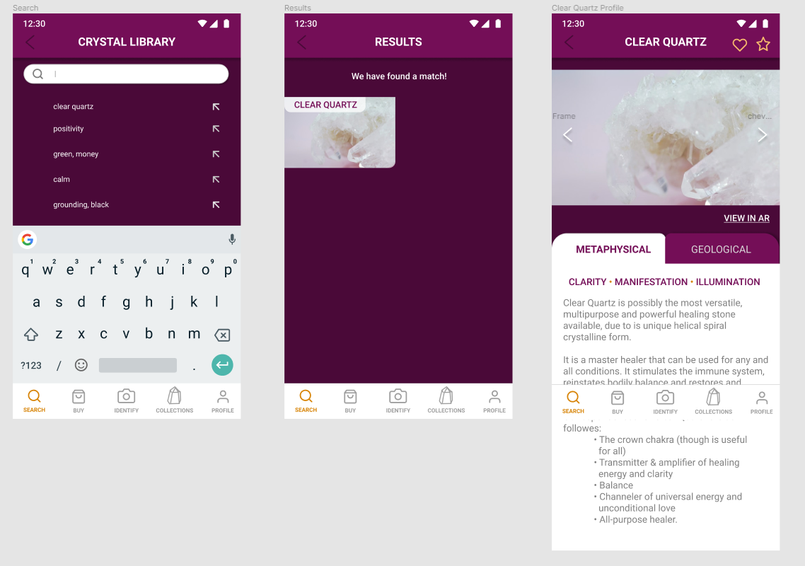
LOOKING UP CRYSTALS

USER PROFILE VIEW AND AR

SHOPPING PART 1

SHOPPING PART 2
USER TESTING (ROUND 3)
The following were comments made by those walking through each screen/step.
A consistent behaviour seen was during the identification path, in which the users would tap on the top of the “Is this correct?” tab, instead of tapping the plus/expansion button.
When it came to looking up a specific crystal (in this case, clear quartz) in the crystal library, the users all proceeded with the same steps, each of which got them straight to the end of the task without issue or struggle.
While asked to add clear quartz to their collections list, the younger testers identified the heart icon as being the way to complete the task, whilst the older testers struggled.
During one struggle to complete the task, the user scrolled up and down on the clear quartz profile, when they did not find either they went to the collections tab, then returned to the clear quartz profile and tapped the star icon. When the star icon did nothing, they proceeded to tap the heart.
When asked what they were thinking throughout the process, they responded saying they were looking for a “+” button somewhere on the profile page in order to add the crystal to the list.
The final task was to search for clear quartz being sold in the marketplace, refine the search results to “low to high prices” and show only stores with 4-5 star ratings. After doing so, the user was then asked to add a single clear quartz to their cart. This task was completed with no visual struggles.
Other comments made by users after testing go as follows:
Everything was easy to read
It was user friendly
The AR feature would be very helpful to those who have an aesthetic for their home and want to see if the item they are purchasing would fit into what they have in mind for their home.
CHALLENGES, REFLECTION, & NEXT STEPS
Challenges that I encountered throughout this process came mainly with prototyping the product. While creating each path, I had an initial amount of screens I presumed to need in order to complete a task (as seen in the original sketches). However, as I created them into a high-fidelity format, I noticed more screens and steps were necessary in order to facilitate as seamless and realistic an experience as possible. Being able to filter certain shops or organize results via a user’s personal price range, as well as providing an option for a user to confirm they would like to add a crystal to their collections list, became clearer to me during this process.
A lot of realizations that I came to were made after doing testing. The main one that has stuck with me pertains to icon choices. Certain icons can mean different things to different people, but there is certainly more of a generally accepted mental model for their uses or definitions. A bulleted list icon, to me, showed a list option to be explored. To others, it appeared to be more of a hamburger menu, instead of a list or collection, as I had intended it to be. The same goes for the heart and star icons; not everyone knew what tapping each meant for them and their experience. Adding a pop up alerting the user to what the action had done was my best bet at tackling this problem without needing to insert textual instructions. Furthermore, with the aid of more testing, I was able to discover a possible preferred icon, the “+” sign, as another option to use.
My next steps would be to conduct A B testing in regards to the collections path and the icons used. One screen would remain as is — with the heart and star icons — while the other would consist of a “+” sign in place of the heart. During this process, I would hope to discover which icon is most effective with both age groups. As it would be a low effort change to make, it would be ideal if said change would make the task easier to complete for all users, instead of only one.