Tackling bulb’s Universal Header for Navigation (Research)
Identifying the Problem
As one of bulb’s UX Designers (and researcher), I was able to have frequent discussions with the CARE team’s leader. During one of our conversations, she had presented to me a repeated concern coming from both herself and the customers of bulb: they all wished the website was easier to navigate through. Often times, users were struggling to locate certain feature links on both their own pages and those of others, as well as knowing how to return to previous pages without needing to rely on the browser’s back button.
Investigation
Before searching for a solution the to problem, I wanted to investigate further into the current state of the navigation header of bulb’s website. In doing so, I compiled images of the navigational menu, as well as created sitemaps and userflows to better understand the way in which it was designed, as it was originally created in 2017. The menu would slide down, and push the content of the page you were on down with it, to reveal each menu icon’s content.


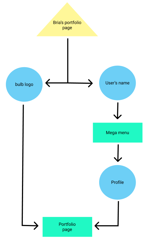
The five components of the navigation are represented by the user’s name (linking the user back to their portfolio home screen), a question mark (linking to the bulb help page), pen and paper icon (giving the user the option to create a new collection or page), a magnifying glass (showing a search bar), and a hamburger menu (revealing a mega menu containing the majority of the site’s links). This is a lot packed in a menu.
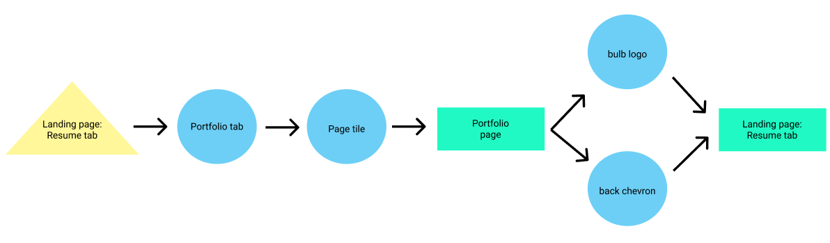
When visiting someone else’s page, the entire header changes in order to show a new menu made specifically for viewing content that is not yours. A triple dot menu has replaced the previous five icons, the bulb logo (which returns the user to their portfolio home page) is now centered, and a back chevron is made available. The obvious issue with this change is there is no way to access any of the previously available features from pages like this.
In order to better see the process of accessing said links, I created a few userflows and sitemaps pertaining to the current navigation menu.


Role: UX Researcher
Methods: Market research & card sorting
Tools: Figma & Miro


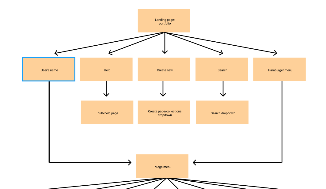
The current navigation menu
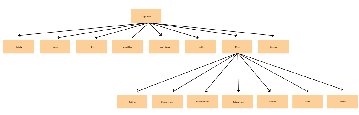
The current navigation menu cont.
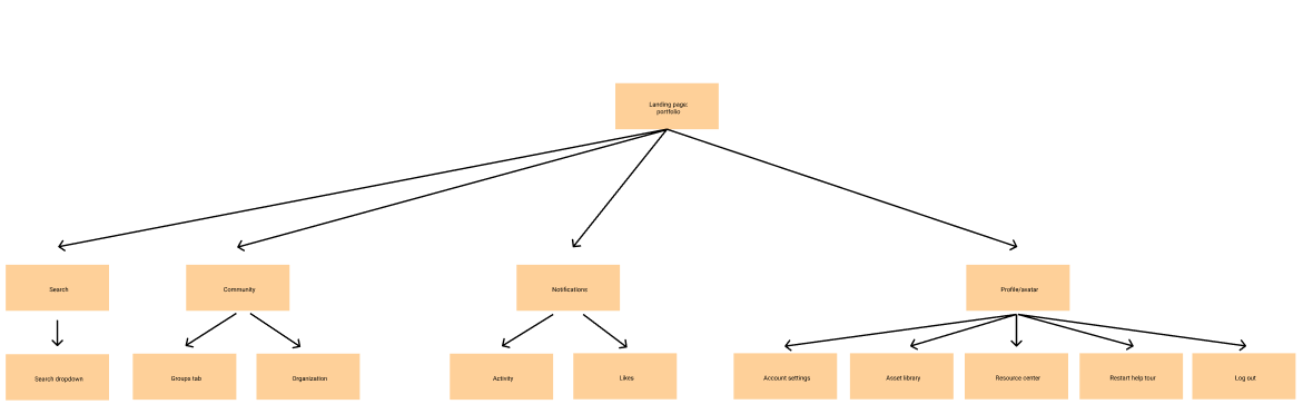
My proposed navigation header to always be present
After showing the product manager how the website currently flowed, it was easy to see that the process was rather repetitive, convoluted, and/or capable of overwhelming and confusing the user. My proposed universal navigation header ideally would create a simpler and easier to follow flow for the user when navigating throughout bulb.
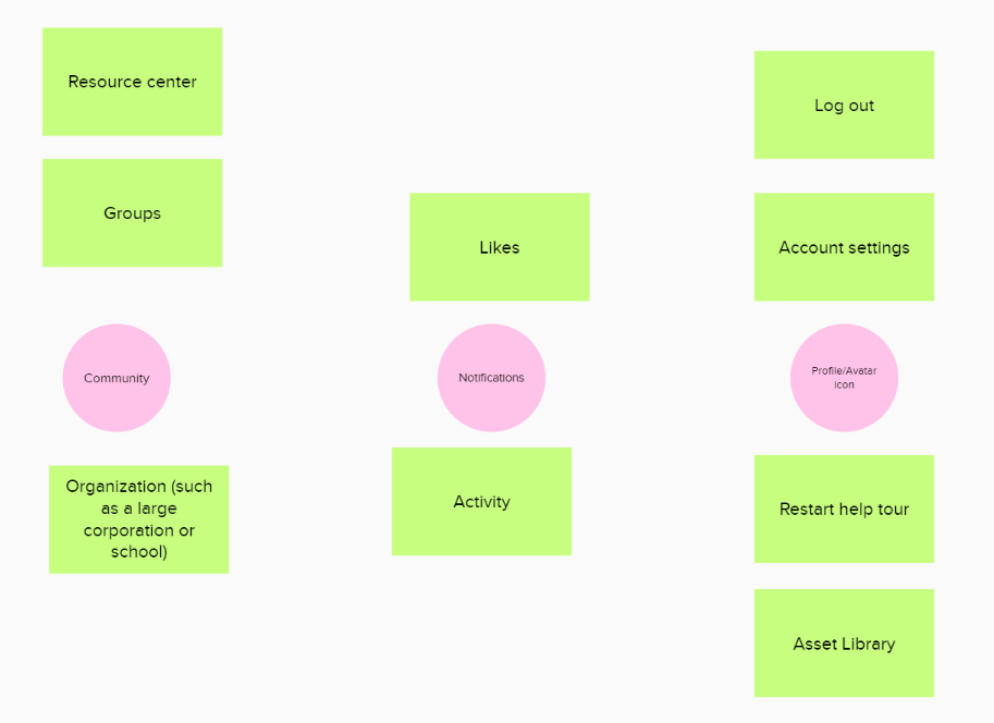
Before getting started on wireframing my idea, I wanted to be sure my own mental model and placement of certain links within the menu would match that of the majority of users. In order to do this, I conducted market research, as well as a card sorting activity to collect data and come up with an average in terms of expectations. My market research focused on the navigation menus of Instagram, Twitter, Facebook, and Tumblr.
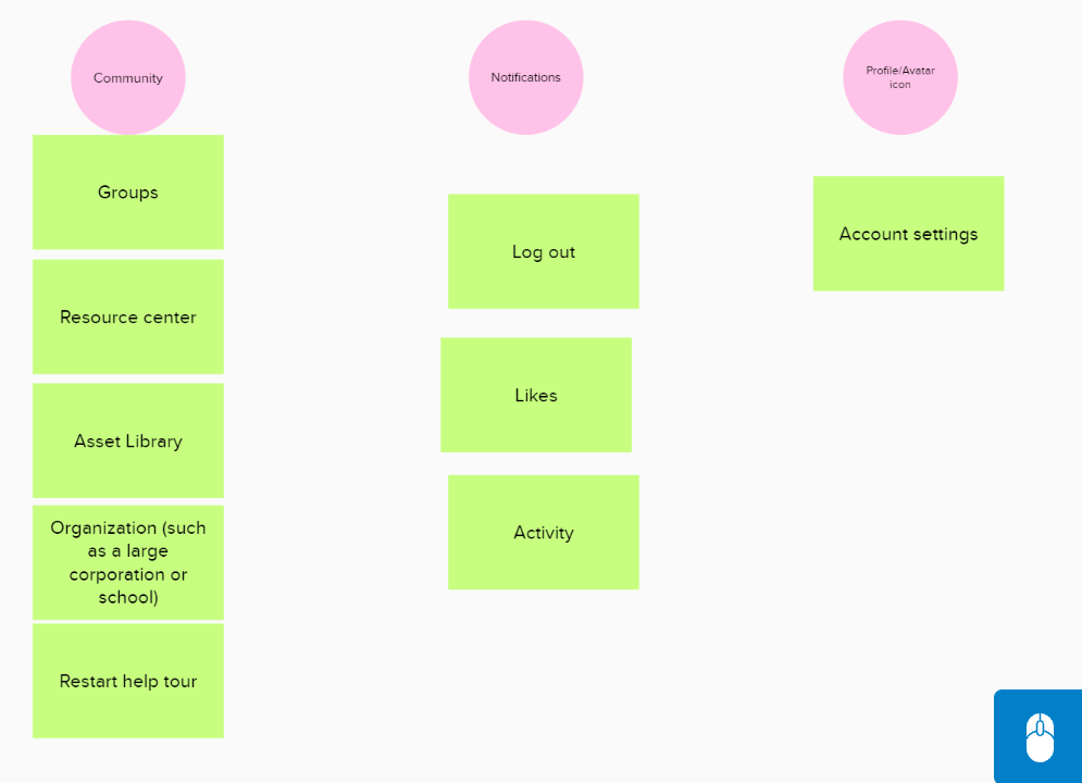
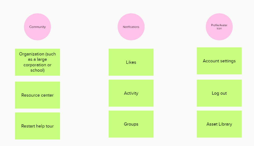
I found that, on average, users expected the community tab to house: groups and a link to organizations (if a user is part of one), the notifications to show: likes and activity, and their profile icon to have: account settings, asset library, restart help tour, and the log out button.
Research